A quick start guide on dynamic JSON based HTML forms in Angular
Hello,
In this post, I am going to show you an easier way to generate Angular forms (with validations!) using a simple JSON object.
TL;DR
For example, to generate a form for user login, we would provide the following JSON payload.
fields = [
{
    key: "email",         # <-- unique identifier for the field
    type: "input",        # <-- Inform library to render a text field
    props: {
        type: "text",     # <-- Informs what kind of `<input>`
        required: true,    # <-- equivalent to `Validators.required`
        label: "Email",
        placeholder: "Enter email address"
    }
},
{
    key: "password",         # <-- unique identifier for the field
    type: "input",        # <-- Inform library to render a text field
    props: {
        type: "password",     # <-- Declaring a password field
        label: "Password",
        required: true,    # <-- equivalent to `Validators.required`
        minLength: 6,    # <-- equivalent to `Validators.minLength(6)`
    }
},

]
It's that simple! Do I have your attention now? Read on.
Implementation
Let's create a new Angular project.
$ ng new json-forms
We need to install a couple of things:
@ngx-formly/core- This library provides us with a simple way to build JSON based formsStyling the forms - I am using Bootstrap as an example.
1.bootstrap- The will change depending on your chosen UI library.
2.@ngx-formly/bootstrap- Formly's wrapper UI library for BootstrapThere are a wide variety of UI libraries supported by Formly. Check the link for more info.
$ npm install @ngx-formly/core @ngx-formly/bootstrap bootstrap@latest
We import FormlyModule and FormlyBootstrapModule into app.module.ts.
import { NgModule } from '@angular/core';
import { BrowserModule } from '@angular/platform-browser';

import { ConfigOption, FormlyModule } from '@ngx-formly/core';
import { FormlyBootstrapModule } from '@ngx-formly/bootstrap';

import { AppComponent } from './app.component';
import { FormsModule, ReactiveFormsModule } from '@angular/forms';
import { FormlyController } from './formly.controller';

const formlyConfig: ConfigOption = {
...
};

@NgModule({
  declarations: [
    AppComponent
  ],
  imports: [
    BrowserModule,
    FormlyModule.forRoot(formlyConfig),
    FormlyBootstrapModule,
    FormsModule,
    ReactiveFormsModule
  ],
  providers: [],
  bootstrap: [AppComponent]
})
export class AppModule { }
Let's see what goes into Formly's config file. This is the real deal. We specify all your (global) validation controllers & their error messages, custom Formly components for advanced usages, etc.
I found it easier in my projects to export all things Formly inside a formly.controller.ts file and simply import them into AppModule.
FormlyController class
This is a custom TypeScript class comprising static functions that help organize the root config of Formly. I found this to be easier when working on other projects.
Here is the final formly.controller.ts that works for setting up the user login page.
Feel free to adapt this to your needs.
// formly.controller.ts
import { Validators } from "@angular/forms";
import { TypeOption, ValidationMessageOption, ValidatorOption } from "@ngx-formly/core/lib/models";

export class FormlyController {

  // A helper function containing all your required validators.
  // Here, you can specify any custom validations that you might need.
  static getValidators(): ValidatorOption[] {
    return [
       {
        name: 'email',
        validation: (control) => {
          const result = Validators.email(control);
          if (!result) return {email: true};
          return null
        }
      }
    ];
  }

  // Declare a suitable error message for validation errors.
  // Note: In my case, I had to declare messages for
  // built-in Validation types.
  static getValidationMessages(): ValidationMessageOption[] {
    return [
      {
        name: 'required',
        message: 'This field is required'
      },
      {
        name: 'minLength',
        message: (_, f) => 'This field should be atleast '+f.props?.minLength+' characters'
      },
      {
        name: 'email',
        message: 'Invalid email address'
      }
    ]
  }

  // Here, we declare all your custom Angular components
  // that need to render inside <formly-form>.
  static getTypes(): TypeOption[] {
    return []
  }
}
Let's look at AppModule where we initialize and use this config.
// Declare Formly config
const formlyConfig: ConfigOption = {
  validators: FormlyController.getValidators(),
  types: FormlyController.getTypes(),
  validationMessages: FormlyController.getValidationMessages()
};

// Initialize Formly with the config
@NgModule({
    ...,
    imports: [
    FormlyModule.forRoot(formlyConfig),
    ...,
    ],
})
export class AppModule { }
Progress #1
This code should be just enough to render the form. Let's quickly run ng serve on our test project and look at the output.
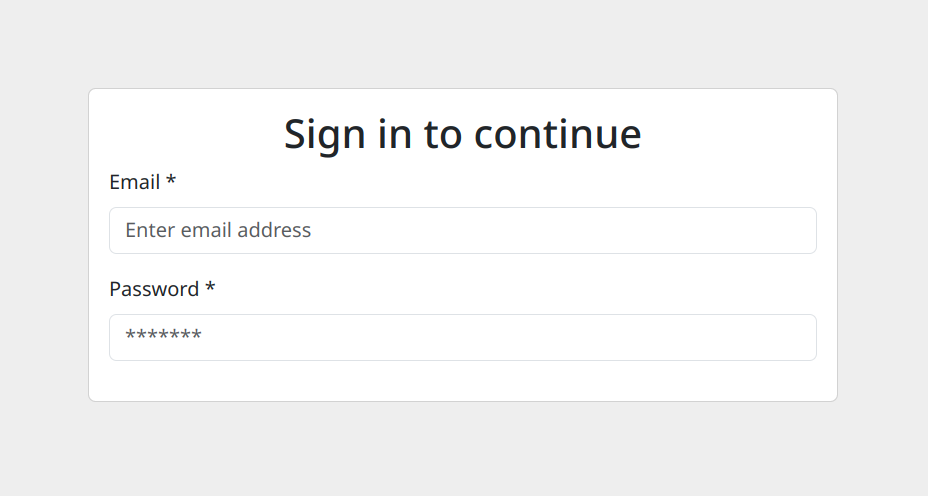
First look:
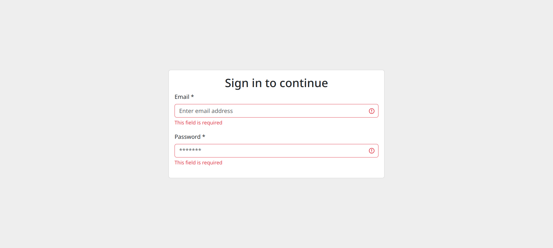
We test required validator below:
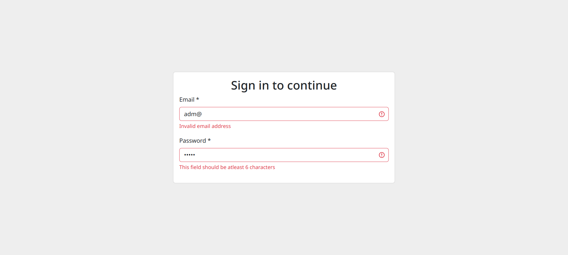
We test the "invalid email" validator and the password's "minLength" validator:
Awesome! How do I submit this form?
How to submit this form?
There are two ways to do this:
The easy way would be to add a
<button>into the HTML file, binddisabledproperty (of the button) to the form and set up a click listener that processes your request.Create a custom button widget in Formly which is reusable.
I will be covering the second way in another post. The link will be added here once it's up.
To get started, let's create our HTML file.
<!-- app.component.html -->
<div class="login-container">

  <div class="card">
    <div class="card-body">
      <h2 class="card-title text-center">Sign in to continue</h2>
      <form [formGroup]="formGroup">
        <formly-form [fields]="fields" [form]="formGroup"></formly-form>

        <button class="w-100 btn btn-primary" [disabled]="formGroup.invalid" (click)="processSignIn()">Sign In</button>
      </form>
    </div>
  </div>
</div>
And here is the source code for the TS file:
// app.component.ts

export class AppComponent implements OnInit {
  formGroup = new FormGroup({});

  fields: FormlyFieldConfig[] = [
    {
      key: "email",
      type: "input",
      props: {
        type: "email",
        required: true,
        label: "Email",
        placeholder: "Enter email address"
      },
      validators: ['email']
    },
    {
      key: "password",
      type: "input",
      props: {
        type: "password",
        label: "Password",
        required: true,
        minLength: 6,
        placeholder: '*******'
      }
    },
  ]

  ngOnInit(): void {
  }

  processSignIn() {
    alert('Sign in called');
  }
}
Lastly, here is the stylesheet used
.login-container {
  display: flex;
  align-items: center;
  justify-content: center;
  height: 100vh;
}

.login-container .card {
  min-width: 600px;
}
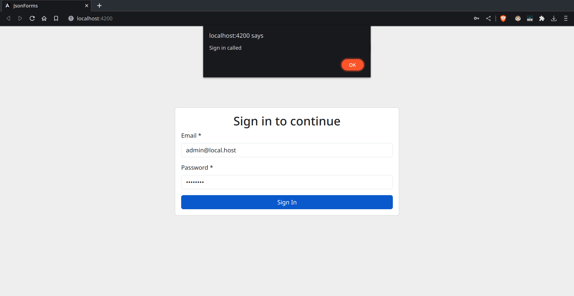
End Result
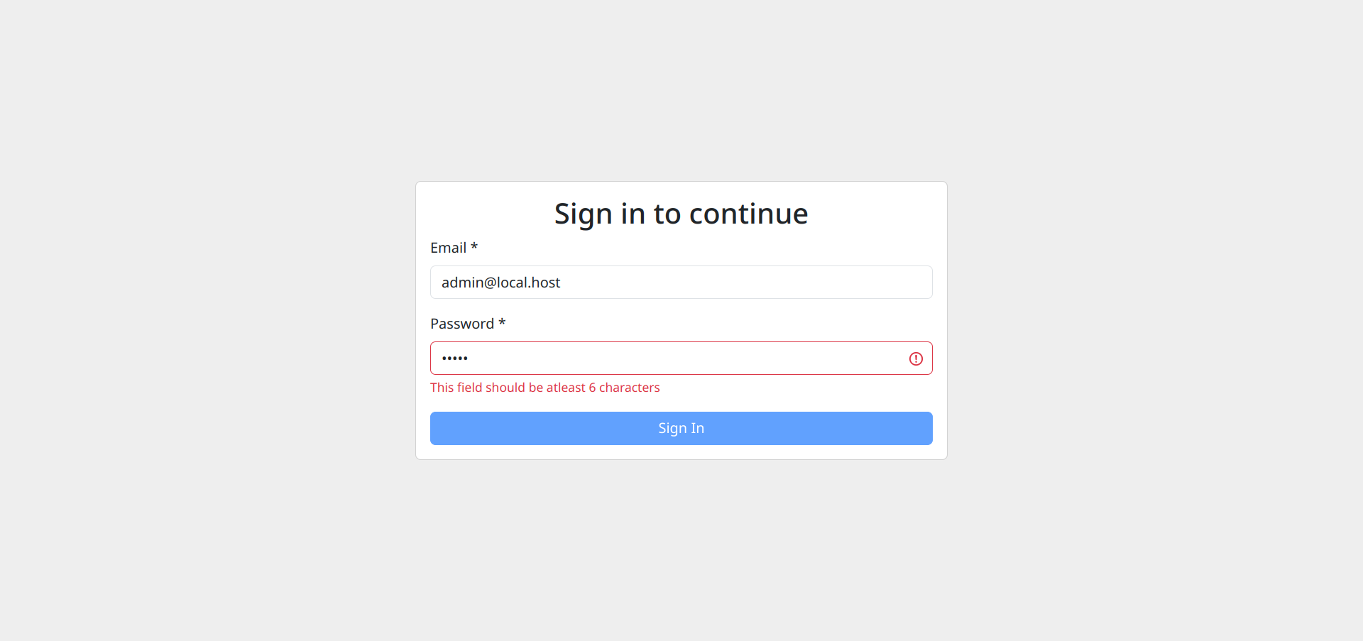
Invalid form details
Notice the button is disabled when validation fails.
Sign In button is clicked.
Conclusion
I hope you've learned something new in this post. Please feel free to add your thoughts below. I would love to know them!
Formly is a great tool for cases where you know the web app has so many HTML forms to write.
Check out Formly by visiting their website here.
If you've liked this post, show your support by using the emojis on the right. It pleases the algorithm :^)
You can also @ me on Mastodon here.
Bye for now.